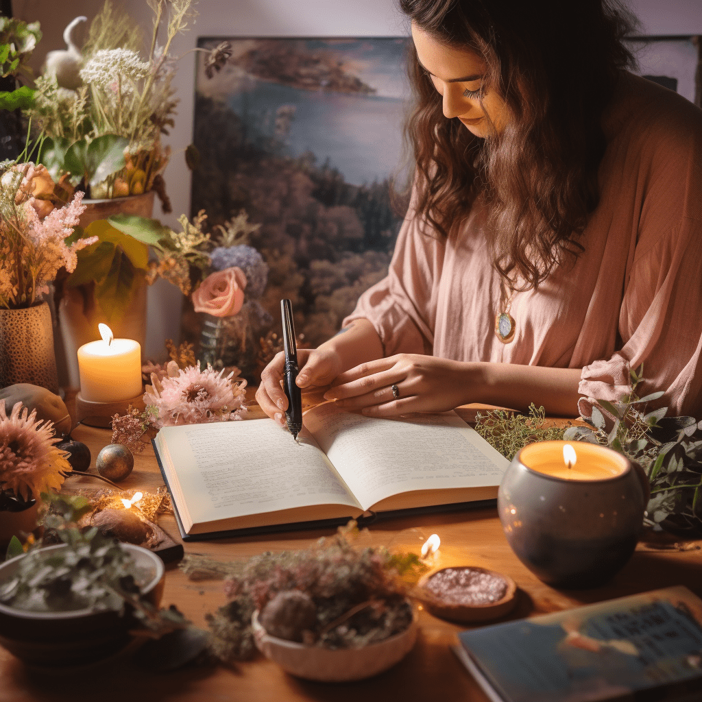
Oh, dear hearts, let me weave you a tale of a world where simplicity meets enchantment—a realm I hold near and dear, the cottagecore aesthetic. It’s like stepping into a storybook, where every nook is a snug haven and every cranny whispers tales of yore. Can you picture it? It’s the stuff of dreams, really; a tapestry of pastoral bliss that wraps around you like a well-loved quilt.
Now, you might ask, “What’s this cottagecore fuss all about?” Well, let me tell ya, it’s a harkening back to the good ol’ days, where life was slower and filled with the kind of joys you find in the rustle of leaves or the babble of a brook. It’s about creating a space that feels like an embrace from Mother Nature herself. You know, the kind that makes your heart sigh with contentment?
- It’s about homemade loaves of bread, their scent wafting through the air.
- It’s about hand-stitched quilts, each stitch a testament to care and craft.
- And it’s about garden blooms, the earth’s own poetry in color.
But it ain’t just about the look, my friends. It’s a whole vibe—a lifestyle, some might say. One where you churn life at your own pace, dancing to the tune of the wind against the willows. And boy, it’s a tune that fills your soul with a peace as deep as the roots of an ancient oak. Ain’t nothin’ quite like it.
So grab a cuppa, pull up a chair by the hearth, and let me guide you through the wonders of the cottagecore world. We’ll explore every shade and hue that paints this delightful picture. And who knows? Maybe you’ll find a little piece of that tranquility to tuck into your own pocket of the world. 🌿🏡
In closing, this magical tapestry of cottagecore ain’t just an escape; it’s a way of living that gently nudges us to slow down, breathe in the beauty around us, and cultivate a little garden of serenity in our hearts. Thank you ever so much for joining me on this ramble. Stay cozy and keep cultivating your own kind of wonderful.
With love and rustling leaves,
Your Cottagecore Confidante 🌼✨

The Serene Spectrum: Defining the Cottagecore Color Palette
Ever wandered through a sun-dappled glen and felt like each hue whispered secrets of serenity and simplicity? That’s the magic of the cottagecore color palette, my friends! It’s all about embracing the tones that nature’s spun together in her loom, creating an aesthetic that soothes the soul and tickles the heart with rustic charm. 🌿
But what colors are we talkin’ about? Well, let’s dive in. Picture the soft, unassuming browns of a well-trodden woodland path or the creamy whites of fresh milk – a staple in any cottagecore kitchen. These are the colors that set the stage for a harmonious living space. Simplicity is key, wouldn’t you agree?
- Earthy Browns
- Creamy Whites
And don’t get me started on the joy of a neutral beige – it’s like the bread and butter of the cottagecore palette! It pairs with anything and everything, kinda like that wildflower bouquet you just can’t help but put in the center of your worn wooden table. 🌼
These hues, they aren’t just colors; they’re a warm embrace by Mother Nature herself. They’re the canvas upon which we can throw splashes of more vibrant tones, like a pop of daisy yellow or a smidge of robin’s egg blue. But that’s a tale for another day. For now, let’s bask in the understated beauty of the cottagecore base tones, shall we?
Overall, the cottagecore color palette is a narcotic for the hustle-bustle of modern life, a visual lullaby that sings us back to the roots of what truly matters – a life interwoven with the tapestry of the natural world around us.
In closing, I thank you from the bottom of my rustic, ever-beating heart for sharing in this little slice of color-soaked joy. Stay wild, my dears, and remember to keep life blooming! 🌸
Whispers of Nature: Earthy Tones and Why They Matter
Ever wonder what it’s like to be hugged by Mother Nature? That’s exactly the warm embrace you feel when earthy tones envelop your cozy nook. Rich, soil-hued browns, the soft greens of moss, and the muted greys of river stones – they all play a pivotal role in crafting that cottagecore sanctuary.
Don’t you just love how these colors ground you? There’s something about them that whispers ‘home’ and ‘hearth’. Can you almost smell the petrichor or feel the crunch of leaves beneath your feet? That’s the beauty of earthy tones – they transport you right back to the heart of the forest, where everything is thriving and brimming with life!
- They remind us of the soil that sustains us 🌱
- They echo the bark of the trees that shelter us 🌳
- They mimic the stones that pave our path 🏞️
But hey, it’s not just about aesthetics! These colors offer a sense of stability and comfort. In our bustling lives, who wouldn’t want a space that feels like an eternal, unchanging woodland glade?
Have you ever walked into a room with deep greens and browns and felt that instant calm wash over you? That’s the magic of earthy tones in your living space. They’re not just colors; they’re a lifestyle, a return to roots, a way to keep the outdoors close to our hearts. And let’s face it, we all could use a sprinkle of that serene cottagecore charm in our lives, right? 😉
Overall, finally, embracing earthy tones is like weaving your very own natural tapestry, a backdrop that brings the outside in. Thanks a bunch for reading, lovelies. Stay rooted, stay cozy 🍂✨

Blooms and Blossoms: Incorporating Floral Hues into Your Cottagecore Haven
Oh, how I cherish the dance of colors in a blooming meadow! It’s like nature’s own masterpiece, don’t you think? Floral hues are the essence of the cottagecore dream, breathing life into every nook and cranny of our quaint little escapes. Imagine, just for a second, walking into a room kissed by the gentle pinks of peonies and the vibrant reds of poppies. Makes you feel all warm and fuzzy, right? 🌸
Now, I’m gonna let you in on a little secret—you don’t need a green thumb to bring this floral fantasy to life! Whether you’re draping your walls in rose-patterned wallpaper or peppering your space with lilac throw pillows, it’s all about capturing that wildflower whimsy. And trust me, it’s easier than baking a batch of homemade scones!
- Soft Pinks: They’re not just for nurseries anymore! A blush-tinted vase here, a salmon-colored lampshade there, and voilà! You’ve got yourself a space that’s as sweet as strawberry jam.
- Cheery Reds: Picture this: crimson cushions on a whitewashed wooden chair. Doesn’t it just shout, “Come on in and rest your weary feet!”?
- Sunny Yellows: A daffodil-colored tablecloth can brighten up even the dreariest of days, don’tcha think? It’s like having a slice of sunshine right in your dining room.
Why do we fall head over heels for these pops of petal-inspired pigment, ya ask? Well, they’re not just pretty to look at—they tug at our heartstrings, reminding us of sunlit days spent roaming the countryside or that first whiff of spring after a long, cold winter. 💐
But hey, let’s not forget about texture! Mixing and matching materials like a soft velvet in lavender or a rustic linen in marigold adds depth to our cottagecore canvas. And if you’re feeling adventurous, why not throw in some floral embroidery on your curtains or tablecloths?
Overall, finally, what’s not to love about draping our homes in the hues of nature’s own bouquet? It’s like a love letter to those lazy, hazy days spent picnicking in the grass with nothing but the sound of bees buzzing and birds singing. So go ahead, sprinkle a little bit of that blossom magic around and watch your cottagecore haven bloom! 🌹
Thanks a bunch for reading, my darlings! Remember, life’s a garden, dig it!
Heya, folks! Have you ever felt that golden hour glow, when the sun kisses the horizon and bathes everything in a warm, amber light? That’s the sort of magic I’m weavin’ into my little cottagecore corner with a splash of yellows and oranges. It’s like havin’ sunshine on tap, even on the cloudiest days! 🌞
The Warmth of Sunlight: Embracing Yellows and Oranges in Cottagecore Decor
Now, I’m sure you’re wonderin’, why yellow and orange? Well, let me tell ya, it’s more than just a pop of color – it’s a whole mood. These hues are the essence of cozy, and they bring a slice of the great outdoors right into my living space.
- Yellows – They’re the color of happiness, ain’t they? A buttery wall, a daisy-filled vase, or even a humble bowl of lemons can lift your spirits.
- Oranges – Rich and vibrant, a terracotta pot or a rust-colored throw can evoke those hearty harvest vibes all year round.
But hey, don’t just take my word for it. Give it a whirl, and see how these shades warm up your space. Ever notice how a room with a touch of yellow seems more welcomin’, as if it’s invitin’ you to sit down and sip on some chamomile tea? Or how an orange-tinted cushion can make your reading nook feel extra snuggly? That’s the power of these joyful colors.
I’ve found that the best way to incorporate these tones is to mix ’em with natural materials. Think wooden accents, linen textiles, and oh, a bunch of wildflowers never hurt nobody. It’s like a little dance between color and texture – and trust me, it’s a dance you’ll wanna join.
But remember, it’s not about repaintin’ your entire cottage! Sometimes it’s the little touches – a knitted blanket here, a painted mason jar there – that can really transform a space. It’s all about balancin’ that rustic charm with splashes of sun-kissed hues.
Overall, experimentin’ with yellows and oranges has brought such a zest to my home, like a warm hug from Mother Nature herself. It’s amazin’ how these shades can turn a plain room into a cozy nook that feels like a little slice of sunshine. So, go ahead and sprinkle a little bit of that sunlight into your life. Thanks for droppin’ by – keep bloomin’, keep growin’, and remember, there’s no place like home. 🌼🧡

Cool Tranquility: How Blues and Greens Enhance Cottagecore Calm
Ah, the soothing embrace of blues and greens. Wouldn’t you agree that they’re the heartbeats of serenity in our cottagecore havens? I mean, just think about it – when you’re cozied up in your nook, what’s more calming than a hint of sky blue or a whisper of forest green?
- Why, it’s like Mother Nature herself is giving your home a gentle pat on the back, reassuring you that, hey, everything’s gonna be just fine. 🌿
- And it’s not just a feeling! There’s some real sciencey stuff behind it. Did ya know that these colors can actually lower your heart rate and reduce anxiety? Talk about a natural remedy, huh?
But let’s get real for a sec – how do you weave these colors into your abode without feeling like you’ve just stepped into a paint bucket?
- Start with accent pieces. A few throw pillows here, a knitted blanket there, and voilà! You’ve got yourself a splash of calm without overwhelming the senses.
- Ever think about houseplants? Seriously, they’re the MVPs of bringing in that green goodness. And the best part? They’re alive! Talk about bringing the outdoors in. 🌱
- And for my fellow thrifters out there, vintage finds in these hues can add that timeless charm we all adore in cottagecore aesthetics.
It’s not just about looks, though. Surrounding yourself with these colors can feel like a big ol’ hug for your soul. They’re the backdrop to your peaceful moments, your cup of tea, and your daydreams about quaint cottages and rolling hills.
Now, don’t get me wrong – a pop of color here and there never hurt nobody. But there’s just something about blues and greens that says, “Hey, take a deep breath, slow down, you’re home.”
In closing, blues and greens aren’t just colors – they’re a mood, a way of life, and a staple in our cottagecore hearts. So go on, invite them in, and watch as they work their magic on your space and spirit.
Thanks a bunch for reading, kind souls. Keep living the simple, harmonious life, and remember: every day is a chance to create your own slice of pastoral bliss. 💚

Vintage Charm: The Role of Pastel and Muted Shades in Cottagecore Living
Oh, how I adore the soft whispers of pastel and muted shades in our darling cottagecore settings! There’s just something about those hues that take you right back to simpler times, don’t you think? They’re like a gentle hug from history, wrapping us in the comfort of the old-world charm with every glance.
Have you ever wondered why these powdery tones feel so at home in a cottagecore environment? Well, it’s like they’ve been churned from the very essence of tranquility; they’re the visual equivalent of a leisurely stroll through a meadow at dawn. And isn’t it fascinating how these colors can instantly soften a room, making it feel as if you’re living inside an Impressionist painting?
- Embracing Imperfection: The beauty of pastels lies in their ability to celebrate imperfection. A scuffed table or a faded fabric? No problem – it adds to the authenticity!
- Harmonious Contrast: Pairing pastels with darker, rustic elements creates a delightful contrast. It’s like watching the soft bloom of wildflowers against the rugged countryside.
- Whispers of Romance: These shades aren’t just about aesthetics; they evoke a sense of romance and nostalgia. A powder blue vase or a dusty rose quilt – they tell a story, don’t they?
Personally, I’ve found that incorporating a touch of these dulcet tones into my cottage abode creates a serene atmosphere that’s just… well, it’s like a balm for the soul, ya know? 😌 And here’s a little secret – you don’t need a lot. Sometimes, it’s just about that single chalk-painted chair or those antique, lace curtains that whisper tales of yesteryear.
And let’s not forget the emotional connection. These colors aren’t just seen; they’re felt. They remind us of the sun-bleached pages of a well-loved novel or the delicate patina of heirloom china. Can you feel that? That’s the heart of cottagecore speaking to you.
I’ve had my share of challenges, trying to balance the old with the new. But, by embracing the imperfections and creating a dialogue between the eras, I’ve carved out a space that’s uniquely mine. And you can too!
Remember, it’s all about creating a story with your space, where every muted tone adds another chapter to the tale of your homey haven.
Overall, bringing pastels and muted shades into your cottagecore lifestyle isn’t just about following a trend. It’s about crafting a narrative that’s as rich and complex as the history behind these timeless tones. It’s about finding beauty in the soft, quiet corners of life and allowing your home to be a reflection of that.
Thank you for sharing a moment of your day with me, lovelies 💕And remember, in a world of hustle and bustle, a pastel touch can be your personal pause button.
Stay cozy and chic,
Your Cottagecore Confidant