Oh, the charm of cottagecore aesthetic! It’s like a melody that plays softly through the patterned curtains and dances across the well-loved wooden floorboards of a cozy rural hideaway. Ever wondered what makes our cottagecore hearts sing with such content? It’s the symphony of colors, my dears, the hues that whisper tales of simplicity and whispering willows. 🌿
Nature’s Palette: Drawing Inspiration from the Great Outdoors
When you think of cottagecore, what colors paint your mind? Maybe it’s the blush of an early rose-dawn, or the gentle green of new leaves. That’s right, nature is our muse, and she never steers us wrong. We’re talkin’ about those natural, earthy tones that make you feel like you’ve just taken a deep breath of fresh, country air. 🍃
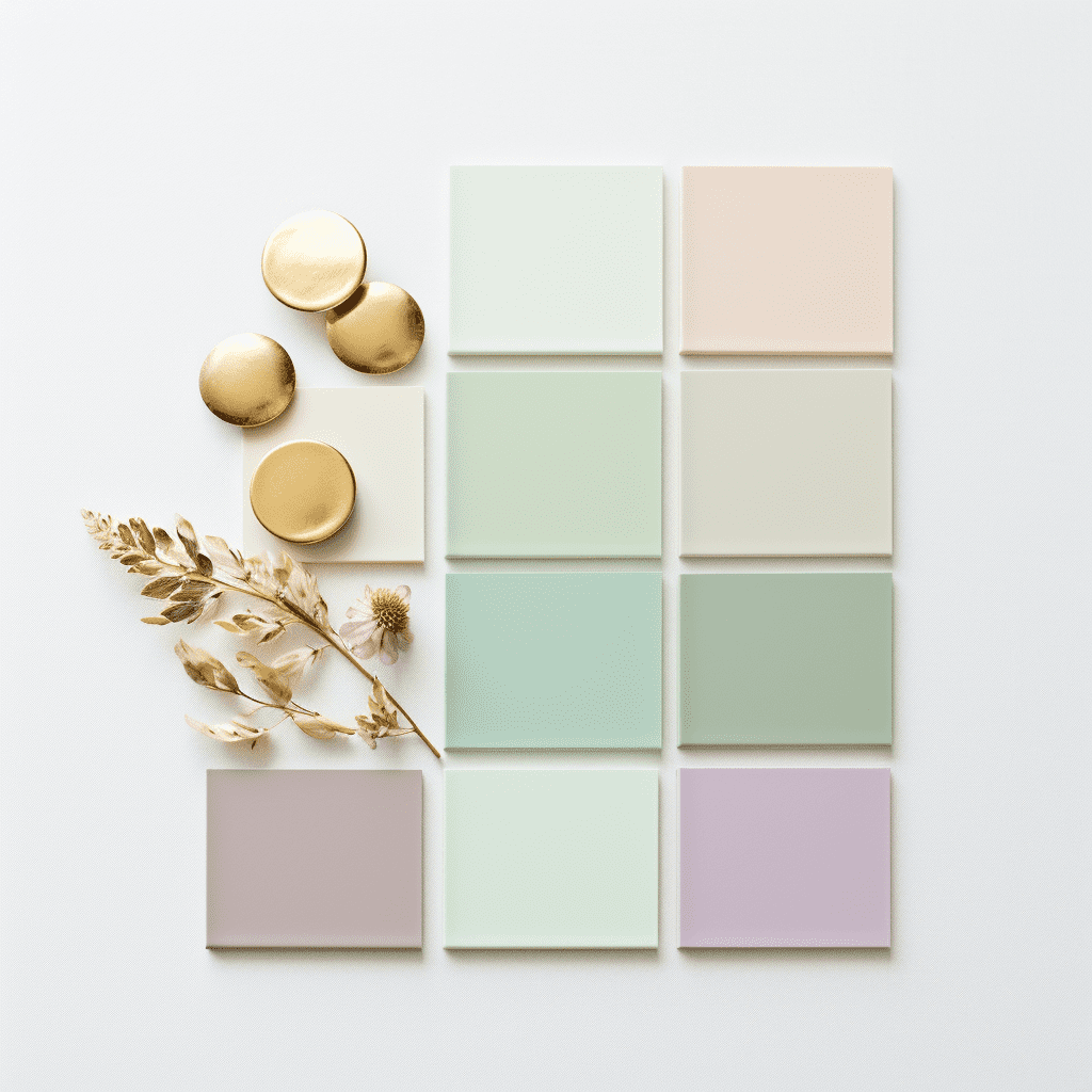
Soft Pastels and Muted Tones: The Heart of Cottagecore Chromatics
And let’s not overlook the darling soft pastels and muted tones that give our cottagecore dreams their heartbeat. They’re like the gentle pat of rain on a tin roof or the misty fog over a verdant meadow; soothing, tender, and oh so dreamy.
Earthy Neutrals: Creating a Grounded and Soothing Atmosphere
Now, earthy neutrals – they’re the foundation, the bedrock of our cottagecore color story. Imagine the rich soil nestled under your fingertips as you plant your heirloom seeds, or the rugged bark of an ancient oak. These are the shades that keep our cottagecore world serene and grounded.
In closing, whether it’s the soft pastels or the rich, earthy hues, each shade in the cottagecore palette weaves its own unique strand in the tapestry of this enchanting aesthetic. And I tell ya, each color is as important as the next in creating a space that feels like a warm embrace. Thanks for stopping by, lovely souls. May your days be as colorful as a cottage garden! 🌸
Nature’s Palette: Drawing Inspiration from the Great Outdoors
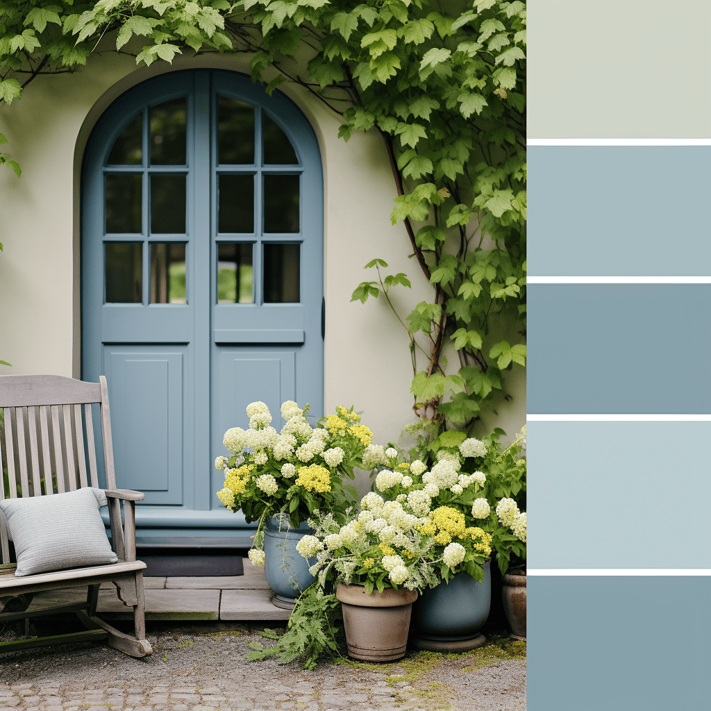
Hey there, my dear friends! Have you ever found yourself just staring out into the wild green yonder, absolutely smitten with the colors that Mother Nature showcases? It’s like she’s got her own color wheel, and lemme tell ya, it’s simply divine. Now, as a cottagecore enthusiast, I can’t help but get giddy about bringing those serene vibes indoors. 🍃
When thinking of nature’s palette, what comes to mind? For me, it’s the soft greens of new leaves, those blush pinks of early dawn, and the calming blues of a clear sky. And let’s not forget the warm yellows of dappled sunlight! It’s not just about colors though—it’s about the feeling. These hues, they speak to the soul, don’t they?
- Greens: From sage to olive, they’re the backbone of our cottagecore color story. They’re like a hug from the forest itself!
- Blues: Sky and water, they bring a sense of tranquility that’s just so…ahh.
- Pinks: Delicate and lively, just like the first bloom of roses by the window.
- Yellows: Sunny and bright, they remind us of those lazy afternoons in the meadow.
And here’s the scoop—when you’re bringing these colors into your space, think about balance. A splash of green here, a dash of pink there, and before you know it, voilà! Your home is a mirror of the great outdoors. And who wouldn’t want to live in a space that feels like a gentle embrace from Mother Nature herself?
What about you? What colors do you see when you daydream about nature? Tell me, I’m all ears! 🌸
Hey there, my kindred spirits of the quaint and quiet life! Ever find yourself swept up in those dreamy soft pastels that just seem to whisper of simpler times and gentle living? 💐 Well, you’re in the right spot, ’cause today I’m gonna share some musings on the very heart of our beloved cottagecore chromatics – those soft pastels and muted tones that make our hearts flutter like a butterfly in a meadow.
Embracing the Pastel Palette
Picture this: a dewy morning with the softest of blues and pinks painting the sky, creating a canopy over a world that’s just waking up. Those are the colors that fill our souls, aren’t they? They’re like a sweet lullaby for the eyes, soothing and ever so comforting. 🌸
I gotta say, there’s nothing quite like the tender touch of lavender or the whisper of mint green to set the tone for a tranquil abode. These hues, they don’t shout; no, they speak in hushed tones – they’re the kindly neighbors who always greet ya with a smile.
Why Muted Tones Speak Volumes
- They’re unassuming, blending seamlessly with every turn of your home.
- They create a canvas for your life, letting your moments shine.
- They reflect the very essence of cottagecore: simplicity, serenity, and an unspoken bond with nature.
Soft Hues, Deep Connection
And let’s not forget how these pastels, they’re like the thread that weaves through our everyday – from the blush of our garden roses to the hue of freshly churned butter. They’re the colors that tell the story of a life lived with intention, with hands in the earth and hearts in the clouds. 🌼
So, why do we cherish these subtle shades, you ask? It’s ’cause they help us create a space that’s not just seen but felt. They embody the gentle hum of the countryside, the patina of cherished heirlooms, and the embrace of a well-loved quilt.
Now, don’t be shy in letting these tones tiptoe into your life. Let ’em sweep through your cottage, leaving a trail of peace and a whisper of yesteryear’s charm. ‘Cause at the end of the day, it’s all ’bout creating a haven that feels like a warm, heartfelt hug.
In closing, remember to tune into the quiet beauty of soft pastels and muted tones. Let them be the backdrop of your cottagecore dreams, and watch as they bring a gentle kind of magic to every nook and cranny of your cozy corner in the world. ✨
Thank you ever so much for reading, lovelies! May your days be filled with all the tender hues of our cottagecore rainbow. Keep blooming where you’re planted! 🌷
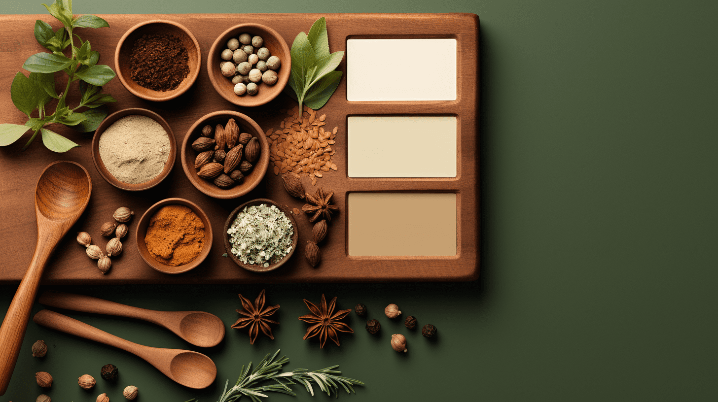
Earthy Neutrals: Creating a Grounded and Soothing Atmosphere
Oh, how I adore the calm and nurturing embrace of earthy neutrals in our cottagecore havens! Isn’t there something just so magical about colors that whisper the tales of the earth and forests? There’s a reason why we’re drawn to them like bees to blossoms 🐝. These soft hues are the very essence of a grounded lifestyle, don’t you think?
Imagine with me, the gentle hues of a deer’s coat or the warm embrace of a sun-baked path winding through the woods. These colors, my friends, they’re the unsung heroes of the cottagecore palette. They’re not shouting for attention, yet they set the stage for a space that’s as comforting as a warm, knitted blanket on a brisk autumn day 🍂. And let’s be honest, who doesn’t want to feel that kind of comfort every day?
- Tawny Taupe – It’s like the soft touch of tree bark, resilient and protective.
- Clay Red – A gentle nod to the potter’s wheel and the artistry of hand-shaped ceramics.
- Moss Green – A hushed echo of the forest floor beneath our feet.
Now, I know what you’re wondering – “How do I blend these neutrals without my space looking, well, too plain?” The trick, my dear kindred spirits, is all in the texture and natural materials. Think rough-hewn wood, woven textiles, and stone. These elements bring life, depth, and character to the neutrals. It’s about creating layers that feel like a hug from Mother Nature herself!
And don’t forget, lighting plays a key role too. The gentle glow of candlelight or the soft luminescence of the morning sun can transform these humble shades into a dance of light and shadow, breathing life into every corner of your cozy abode.
In closing, embracing earthy neutrals is like writing a love letter to the simpler things in life. It’s a canvas that allows us to find joy in the rhythms of the natural world, and to create a sanctuary that reflects the serenity of the earth. 🌾 So, why not give it a try, and let your heart find solace in the harmonious hues of our beloved earth?
Thank you ever so much for wandering through this palette with me. Keep tending to your dreams until they blossom, and remember – the simplest colors often paint the most beautiful stories.
Enlivening Accents: Infusing Your Cottagecore Palette with Character
Have you ever walked into a room so utterly charming that it felt like a warm hug? That’s the magic of cottagecore accents, my dear friends! It’s all about those whimsical touches that inject life and personality into our quaint havens. But how do we do that without going overboard? Ah, that’s the trick, isn’t it?
First off, let’s talk about color pops. Imagine you’ve got this serene canvas of soft creams and gentle greens. Now, throw in a pillow with a splash of sunflower yellow, or maybe a vase with some fiery poppies. Doesn’t that just make your heart skip a beat? It’s like nature’s gone and whispered a secret joke, and now, your space is in on it too!
- Floral Patterns: Think about those sweet, dainty florals. A cushion here, a tablecloth there, and voilà! You’ve got yourself a room that’s bloomin’ marvelous.
- Textural Twists: Texture’s another way to get that depth and character. An embroidered throw or a knitted pouffe can add layers of coziness that’s just so, well, cottagecore.
- Berry Hues: Now, don’t even get me started on berry tones. A dash of raspberry or a hint of blackberry… they’re the perfect way to add a bit of that ‘freshly-picked’ feel to your abode.
Darlings, it’s all about balance. You want your home to feel like it’s had a good romp through the meadows, not like it’s been ambushed by a paint factory, y’know what I mean? Just a few, carefully chosen accents can take your space from plain Jane to enchantingly eclectic.
And remember, it’s not just visual! A cinnamon-scented candle or the sound of a wind chime can be just as vibrant as a swath of color. Engage all those senses, and you’ll have a room that’s alive with cottagecore splendor!
Overall, it’s about creating a space that feels personal, a little nook in this big, wide world where every knickknack and hue tells a story – your story. So go on, sprinkle a little bit of that cottagecore charm around, and watch your home blossom with character!
In closing, thanks for letting me share a slice of my cottagecore heart with you. Keep on blooming in your own unique way! And remember, it’s not just a style; it’s a way of life 🌿✨.
The Art of Mixing and Matching: Tips for a Cohesive Cottagecore Color Scheme
Hey lovelies! Ever find yourself knee-deep in fabric swatches or staring at paint samples, trying to create that oh-so-perfect cottagecore palette for your cozy nook? Fear not! I’ve been through the meadow and back and let me tell ya, mixing and matching colors for that just-right rustic charm doesn’t have to be like finding a needle in a haystack 😉.
Now, where to begin? Harmony is key in the cottagecore aesthetic – it’s like a melody that gently unfolds, not a cacophony that overwhelms the senses. So, let’s dive into some homespun wisdom and get that color scheme singing with the birds outside your window. Ready to roll up those sleeves?
- Start with Your Staples: Pick a couple of foundational colors that’ll act like the bread and butter of your palette. Soft pastels or earthy neutrals are your best bet – they’re like the soft hum of a lullaby that’ll cradle the rest of your design.
- Consider the Mood: What vibe are you cultivating? A pinch of lavender for tranquility, or maybe a dollop of buttery yellow for a sunny disposition? The colors you choose can really set the tone for your cottagecore dreamscape.
- Add a Dash of Whimsy: Don’t be shy – throw in a quirky accent color! It’s just like adding a sprig of wildflowers to a vase – unexpected but oh-so delightful. A zesty coral or a muted teal can really make things pop!
- Texture Talks: It’s not just about colors, my friends. Texture brings depth to your palette, like the rich patina of worn wood or the nubby feel of hand-woven linen. It’s all about that tactile experience that makes your heart sing.
- Feast for the Eyes: Ever thought of your color scheme as a harvest from your garden? Mix ‘n’ match like you’re plating a vibrant salad – a little bit of this, a touch of that, until it’s a feast for the eyes.
Now, don’t just stick to one pattern or shade like jam on toast – layer those patterns, mix those shades, and let your creativity flow like a babbling brook. And remember, sometimes less is more, but other times, more is a kaleidoscope of joy! 🌷
It’s a journey, sweet peas, and sometimes you might feel like you’re chasing chickens around the yard, but trust your gut. Your cottagecore abode should feel like an extension of the great outdoors, a place where every hue tells a tale of serenity and simplicity.
Overall, just let your heart lead the way and the rest will follow. Nature doesn’t overthink, and neither should you when creating your personal slice of paradise!
In closing, thanks a heap for reading, darlings! Remember, life’s a canvas, so paint it with the colors that make your soul happy. Keep blooming where you are planted, and may your home always be as colorful as your dreams! 🌼💕
Seasonal Splendor: Adapting Your Palette to the Time of Year
Oh, how the seasons do play with our hearts and our palettes! Have you ever noticed how the shifting skies and the whispering winds bring about a most delightful change in our surroundings? They sure have a way of tickling the senses, don’t they? Adapting your cottagecore color scheme to the time of year is like dancing to the earth’s natural rhythms—and I’m here to twirl alongside you through each season’s unique chromatic melody 🍂🌷.
Let’s start with Spring, shall we? As the frosted earth thaws and gives way to sprouting greens, we’re talking soft, blush pinks of cherry blossoms amidst fresh, dewy greens. Imagine these hues in your linens or on your tabletop—like a breath of fresh air after a long winter’s nap.
- Throw in splashes of daffodil yellow on accents
- Maybe a touch of robin’s egg blue to mirror the sky’s new warmth
Then comes Summer, with its sun-drenched days and balmy nights. Here’s where I like to sprinkle in some vibrant colors to match the season’s exuberance. Think sunflower yellows, bold berry reds, and the lush greens of a midsummer’s forest. They say it’s the livin’ that’s easy in summer, and your color choices should be just as breezy.
But don’t forget about Autumn! It’s a symphony of color, wouldn’t you say? The earthy browns, the rustic oranges of pumpkin patches, and the deep reds of apple orchards—oh, it’s enough to make you wanna wrap up in a cozy blanket with a cuppa something warm! A plaid throw here, a terracotta pot there, and your cottagecore abode whispers stories of harvest and gratitude.
And when the world hushes under the Winter snow, our colors grow more intimate. The quiet blues and greys mimic the stillness outside, while creamy whites and rich greens bring to mind evergreens dusted with frost. It’s all about creating that snug, warm haven while the wild dances in the cold outside.
Remember, it’s not just about the colors—it’s the feeling they evoke. The happiness of a sunbeam, the nostalgia of falling leaves, or the serenity of snowfall; they all have a place in our homes and hearts.
Overall, adjusting your colors with the seasons keeps your cottagecore home feeling as alive as the world outside your window. It’s a way to stay connected, to respect the ebb and flow that nature teaches us. And isn’t that what cottagecore is all about?
Thank you, my dear friends, for wandering through the seasons with me. Stay ever so charming and remember—life’s a garden, dig it!